iPad App
Problem to solve and hypothesis
The Nextech iPad app was outdated and needed an overhaul. Numerous complaints from users were coming in through customer service calls.
Old iPad App
My specific role in the project and how I collaborated with others
Senior Product Designer - worked by myself on the design of this project with the product owner and the developers of the iPad squad. We hired a consultancy to help us with this large project and I paired with one of the designers on that team. I was already in the middle of a project to get all of the products in the company with a consistent look and feel, creating a new style guide and design system, so I needed to make sure the iPad app was consistent with the rest of the styling.
How we came to the proposed solution (Discovery)
In the beginning I started gathering information from our product owners and we’d interview our medical practice users during our weekly calls. We wanted to find out what their their process was like in the current app, what their pain points were and what they would like to see improved. Once this data was captured, low fidelity designs were created and validated with the medical practice users. The designs improved the more we got feedback.
How solution will solve the problem (Framing)
The iPad software was also being upgraded at the time of the redesign work. The idea was to incorporate clean lines and use the Angular Material design library elements. The old design had very high resolution images and the outside lines and icons were taking up a lot of real estate space. The new design introduced white space and clean lines.
Proposed Solution
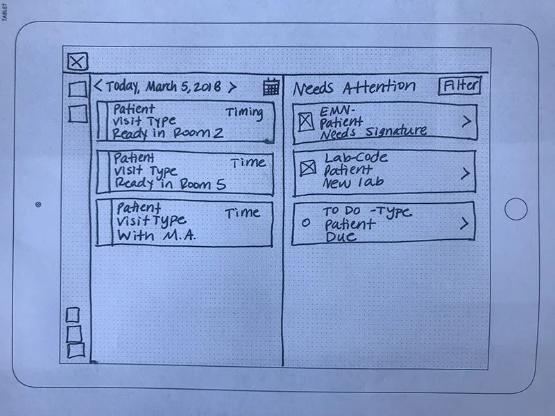
One example solution from the iPad is shown above. The scheduler with notifications that need the user’s attention was created. Each scheduled visit was put into a card that showed a little bit of information about that patient. Once a user clicked on a card, it would bring that patient’s detailed information up.
The second example show below is the waiting room feature. This feature allowed for the user to set the scheduled appointment from the scheduler to an awaiting arrival room. Once a waiting room was available for taking the patient’s vitals and answering the questions, the user could drag and drop that patient into it. When an exam room was ready, that patient could be moved by drag and drop into that section as well.
Challenges faced
The iPad app was very extensive and the entire thing needed an overhaul, but the engineers could only work on one project at a time. Over time, the iPad app would release the new aspects to a testing user group to get their feedback, which meant the app was different between pages. It didn’t have a cohesive look and feel flow for a while, so that posed a challenge for the user.
How project affected users and business
This was a fantastic project for the users and as we continued to work with the users, we were getting more compliments and less escalated calls. The iPad app began a journey of becoming a highly utilized product by many practices.


